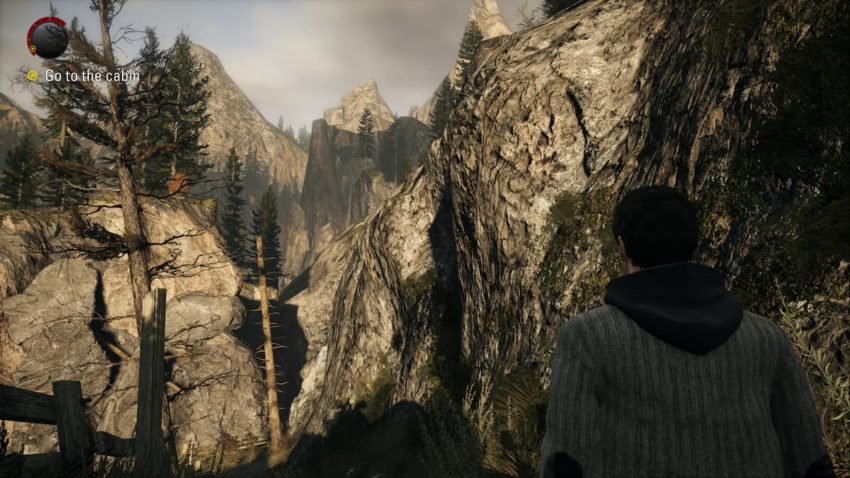
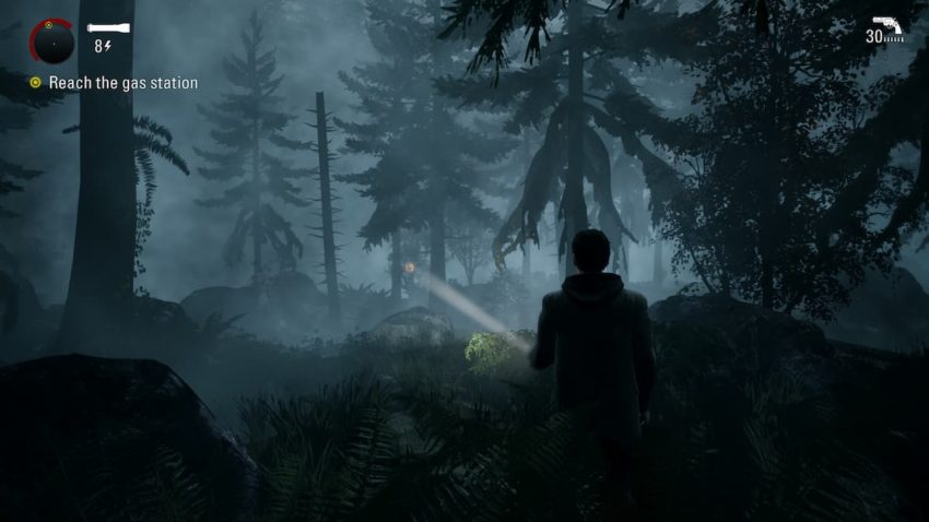
Alan Wake Remastered comes to us 11 years after its initial Xbox 360 release. No longer bound by the shackles of its era’s technical constraints, Remedy’s remaster is transformative. Certain artistic changes won’t please everyone, but that’s always the case with large-scale remasters. You can’t please everyone, but you also can’t dismiss the amount of work poured into Alan Wake Remastered.
To view a Google Drive folder with full size PNGs and split screen comparisons, click here.
Basic rendering set-up

The original Xbox 360 version of Alan Wake rendered at 960×544 with 4X MSAA, a necessary compromise for fitting its visual feature set onto the then aging console. Image quality is remarkably murky on modern 4K displays, appearing almost soup-like. According to Remedy, the Series X version renders at 1440p with the same 4X MSAA pass.
That’s a 7X boost to native pixel counts along with the doubling of its framerate target. This is combined with reconstruction to achieve a 4K output. Given the image lacks the pin-sharp clarity associated with native 4K imagery, Remedy’s claims hold weight. That isn’t to say Alan Wake Remastered is soft — far from it. With that said, it’s surprising it couldn’t reach native 4K on a remastered Xbox 360 game even if it is 60 frames per second.
Head to head comparison
While Remedy listed a series of visual enhancements including improved lighting, visual effects, and textures, how do they translate to the end-user experience? It’s one thing to mention all these improvements. It’s another for those enhancements to provide a tangible impact to the game’s visual fidelity.
Surprisingly, textures receive a noticeable bump across the board. Whether it’s major textures such as the stitching on Alan’s jacket or random levers you’ll never interact with, artwork is radically transformed for the better. The attention to incidental details extends to geometric detail, including more complex rock formations. Remedy even went to the effort of increasing polygon counts on a car’s side view mirror in a cinematic that’s mostly obscured by depth of field.
Hair rendering presents another major improvement. Examining Alice’s hair, it’s more polygonal than you remember — almost clay-like in its clumpiness. The remaster, on the other hand, looks more in line with what you’d expect out of the average modern title. It’s not using state of the art hair rendering, but it is a generational leap over the original implementation.

As far as remasters are concerned, few offer the kinds of wholesale improvements to assets on offer here without betraying the original artwork’s intent. Environments are also more filled out with incidental details. Both outdoor and indoor scenes feature additional objects to provide a more complete setting. The main counter of the diner, for example, is topped with extra condiment bottles, utensils, and a napkin dispenser. There’s even an additional poster in the dining room and extra fixings in the kitchen players can’t enter. These integrations slot so seamlessly into the experience that you’d be forgiven for not knowing they weren’t originally there — the true hallmark of a tasteful remaster.
Not every nip and tuck is successful, however. Remedy took the opportunity to alter Alan Wake’s model to more closely resemble his live action actor. The decision makes sense, but the end-result leaves much to be desired.
Another artistic change that may prove even more controversial concerns the application of fog. On a technical level, the remaster’s volumetrics are higher resolution, but they’re also less pronounced. In most cases, the higher precision effects work is a win. When trudging along the forest, however, the original’s murkier and hazier fog has a stronger impression on the game’s atmosphere.

Of course, fog is only one piece of the puzzle comprising Alan Wake’s atmosphere. Lighting also plays a major role. In that respect, Alan Wake Remastered is a resounding success. Shadows are significantly higher resolution across the board, especially dynamic shadows. The original release also appeared to use a low-quality screen space ambient occlusion setting.
Some objects barely registered pockets of shade whereas in other scenes, the more pronounced ambient shading was much harsher than it should be. Combined with the low resolution shadows, ambient lighting remains one of of the more aged aspects to the original’s presentation. The remaster remedies this with its better shadows combined with a more accurate SSAO implementation that gives objects a more grounded look. Shading is also added to objects that didn’t feature any at all. Overall scene lighting is more natural and realistic, benefitting the kind of experience Alan Wake aims for.
Some players won’t be happy with the few artistic changes that were made. In spite of these alterations, Alan Wake Remastered is one of the most impressive remastering efforts in years. Remedy went beyond the expected bump to assets and rendering, filling out scenes with additional geometry that feels like it was always there. This remaster is worthy of its title’s legacy.


Published: Oct 6, 2021 09:32 am