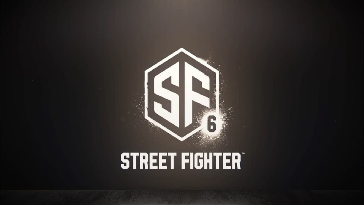
The announcement of Street Fighter 6, while brief, was enough to get fans of Capcom’s premier fighting game franchise excited. The one thing that most people didn’t seem particularly thrilled about was the new logo, which fans have described as boring. Turns out there may be a reason for that: it’s a stock image.
Discovered by Ars Technica creative director Aurich Lawson, the logo looks near identical to a stock image anyone can purchase from Adobe for $80 USD. While the letters are thicker and the outer hexagon thinner in Capcom’s logo, it’s arguably too similar to be a coincidence and suggests Capcom simply paid for the image, altered it slightly, and slapped a six next to it.
At the time of writing, Capcom has yet to deny or acknowledge the situation. Hopefully, however, what this could mean is that the logo is merely a placeholder for the time being and Capcom is designing a more interesting one. The logos for previous games are undeniably a lot more striking and incorporate roman numerals instead of simple digits. Even the logo Boss Logic made prior to the announcement is incredibly distinct and unique compared to the overtly simple one Capcom went with.
Capcom will be sharing more details about Street Fighter 6 this summer, although a new logo is likely the least of fans’ desires for what could be shown. The announcement teaser didn’t feature any gameplay or even confirm which platforms the game will release for, so we can probably expect to see both later in the year.





Published: Feb 22, 2022 09:07 am