Adding new maps to complex team FPS games is always a balancing act. A good example of that is the map Pearl in Valorant. After almost two months of playing on it, it has quickly become one of the more problematic maps due to its winding avenues and tight corners. It favored neither the offense nor the defense, which should be a good thing, right? Not necessarily, as those hidey-holes were difficult to clear on both ends, all at the same time when players had to pay attention to at least two more directions.
It made the map sometimes frustrating to play, but it wasn’t all doom and gloom. Despite those faults, Pearl is an interesting map in Valorant nonetheless and rewards mastery in execution like few others. That’s why Riot has reiterated on Pearl and brought in several changes that should make the map a little bit more readable during gameplay while eliminating or altering some of the most frustrating prefire positions.
All updates to the Pearl map in Valorant
B Main wall
This was one of the first win positions discovered when the map came out, and it remained a position that some players failed to clear even as time went on. Some characters could be practically invisible when crouching here, making clearing it that much more difficult (looking at you, Reyna). With this change, this position will be easier to clear and much more ‘fair’ in terms of defensibility.
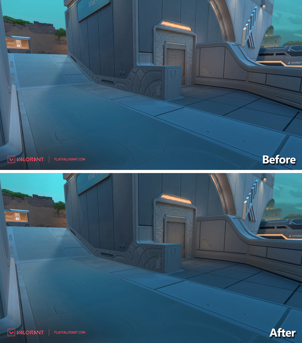
Mid Shops nook
Another one of those positions that were virtually invisible until it was too late, this one saw only situational use, but it was always devastating when employed. Now the platform from Attackers’ spawn is extended all the way to where the boxes were, completely eliminating the nook while leaving the newly made corner for future clears.
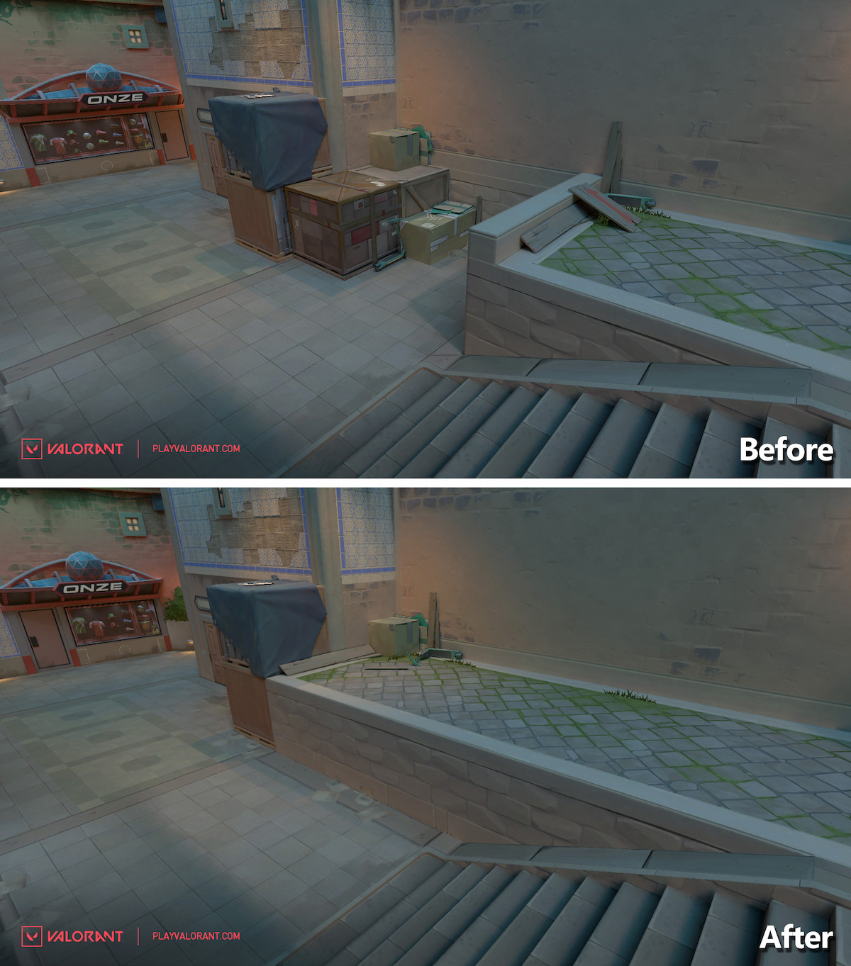
Mid Shops to Mid Plaza corner
This position is another one of those niche hiding places. It was used to set up retake defense, and with how deep the corner goes, it was impossible to clear without pre-firing. Now there will be a plant arrangement with a diagonal profile in that corner, which virtually eliminates it as a defending position.

Top Mid (Library)
This position had a two-way corner setup that was easy to defend by setting up a crossfire. That was because there were two corners for the Attackers’ side to hide and peek from, which would immediately put the Defender’s push on the back foot. Now there will be only one viable corner, making the battleground fairer for both sides.
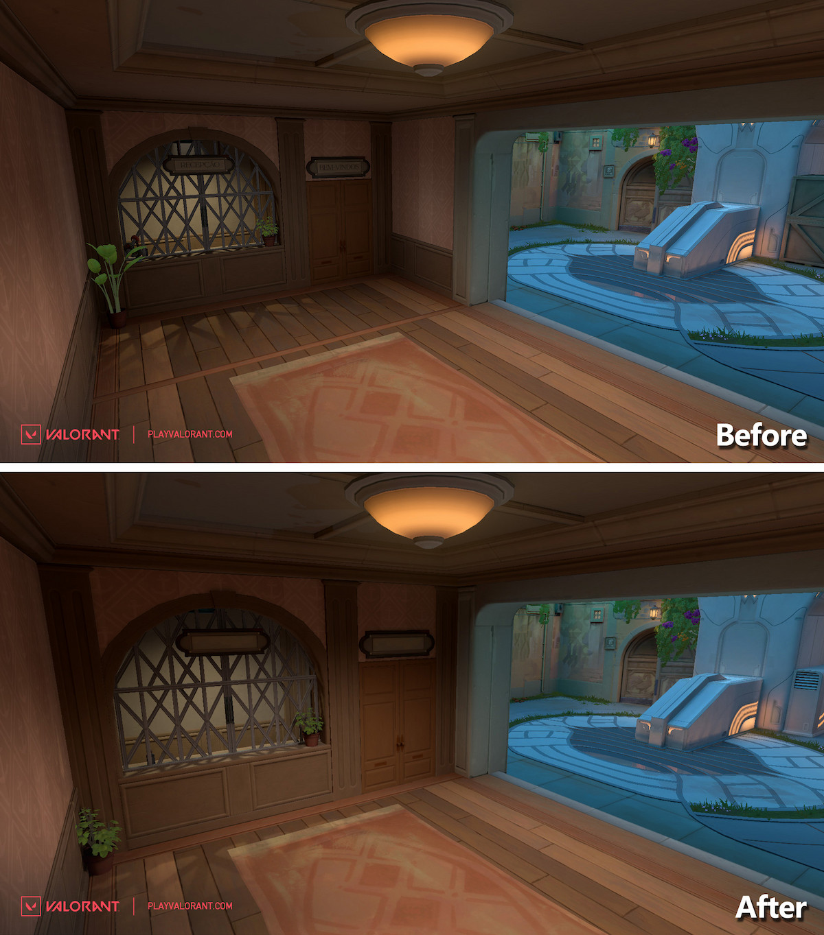
Mid to A (A Art)
Pushing through this position always felt like a trench warfare grind when challenged. There were too many positions to check and prefire, which often required more good luck in rock-paper-scissors than skill. A lot of the clutter in this area has now been removed, making it more readable at a glance, with fewer areas to check as well.
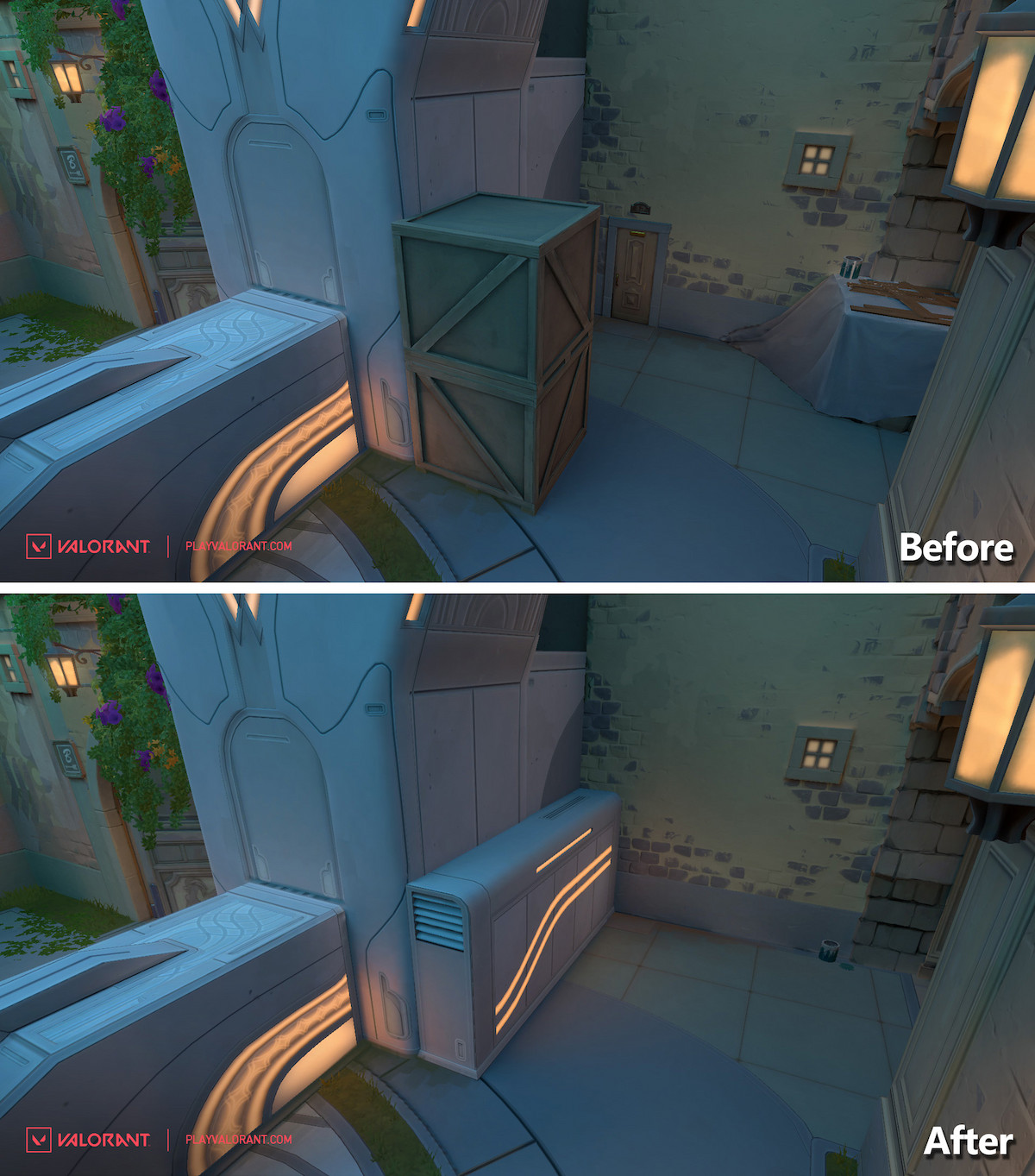
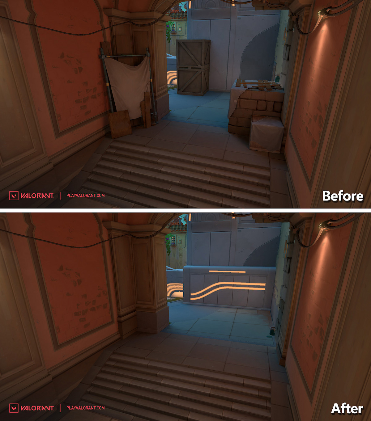
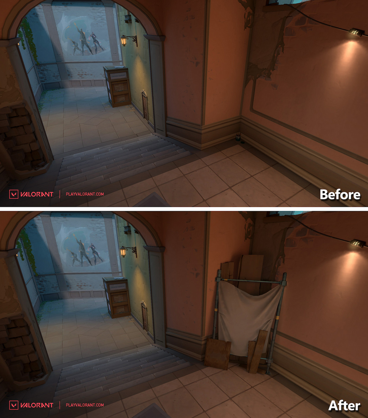
B to Mid (B Link)
Some of the boxes in this narrow area have been reshuffled. In essence, it will change the peeking game slightly and allow defenders caught in a bad position to egress towards B a bit easier than before.
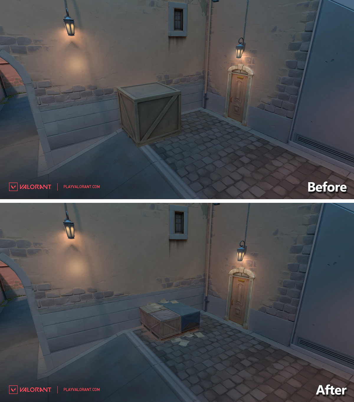
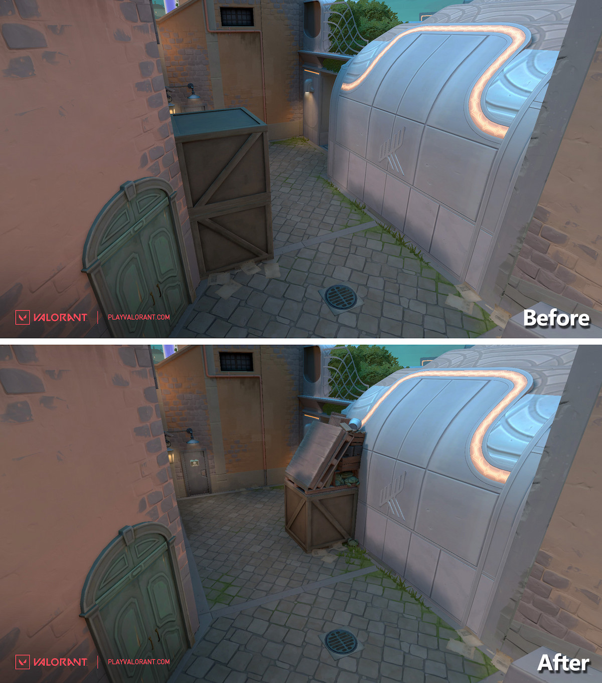
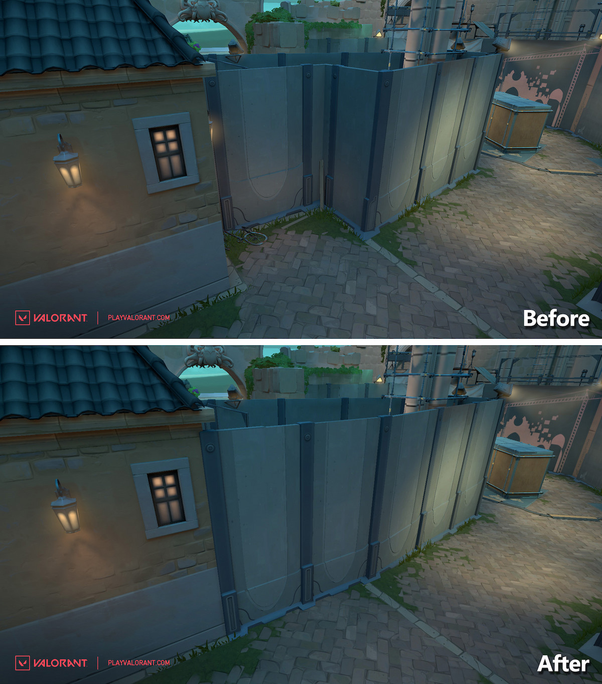
A Main
The weird corner area in A Main has been removed, replaced with a straight panel all the way forward. This is a very welcome change, as the corner was already redundant due to another corner and box stack located on the opposite side towards Attackers’ spawn.
A Main to A Site Stairs
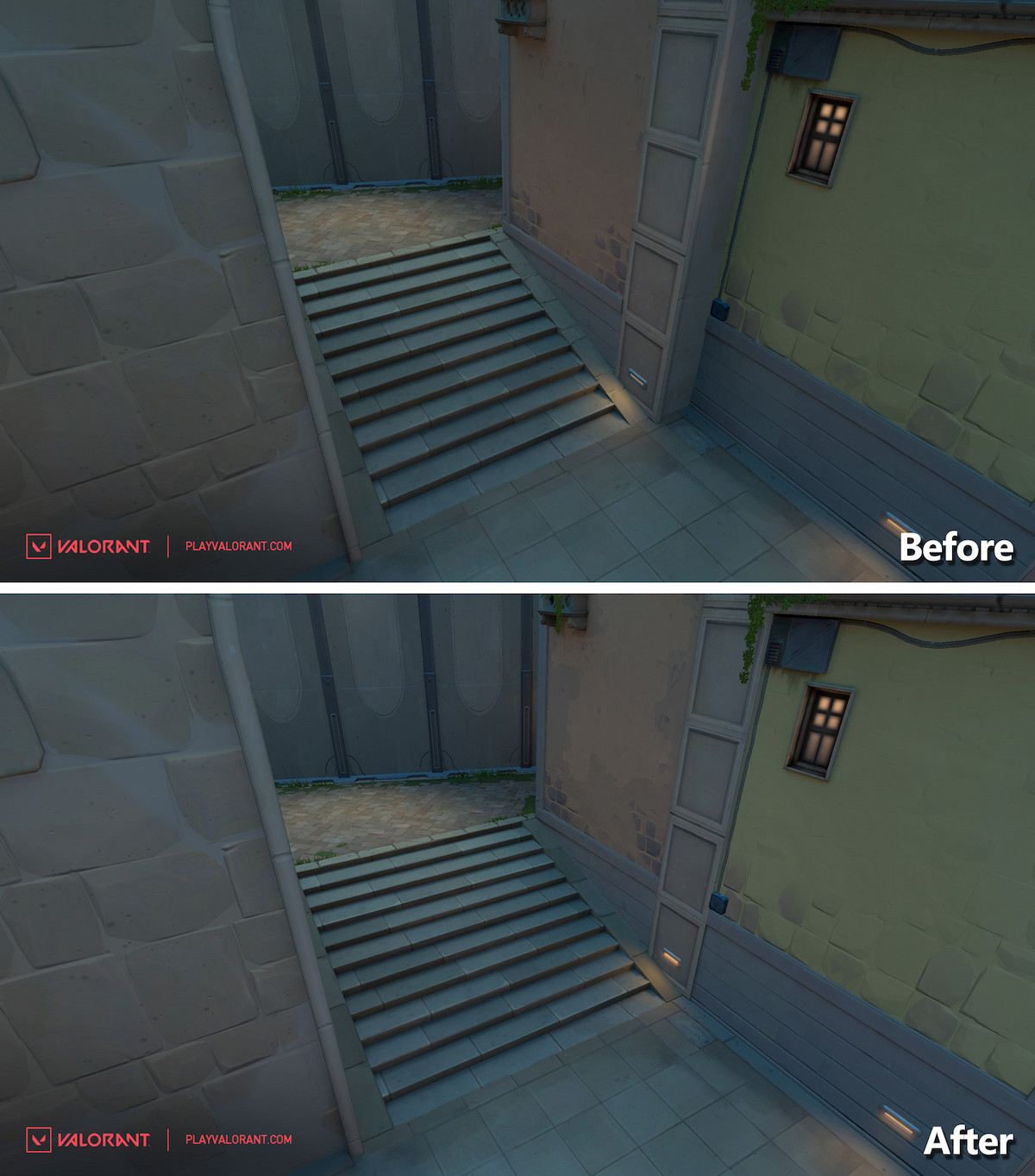
As Omen and Brim mains know, this staircase was horrible to smoke effectively. It was too wide, and allowed for too much setup around it. Now it’s slightly narrower and the cubby on the right side is pulled in, making the whole area more manageable for the utility users.
Related: How to fix the “Queue is Disabled” error in Valorant


Published: Sep 21, 2022 09:51 am