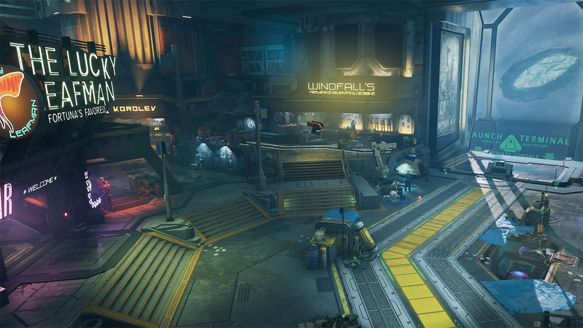
Developer Yager has today shared a look at how Prospect Station, the main hub for players in The Cycle: Frontier, will be completely changed in Season 3. Ever since the game’s launch, the area has felt more like a shopping mall filled with menus, but soon that will shift to it becoming a true station orbiting Fortuna III in space.
When The Cycle: Frontier Season 3 launches on March 29, Prospect Station will be getting much more than a new lick of paint. For the past two seasons, the hub area has been filled with NPCs who represent nothing more than a button to open a menu. That’s changing to make it feel like a living, breathing world where Prospectors buy gear, chill out in their Private Quarters with friends, study the wildlife from the dangerous planet below, and make deals with shady factions.
Related: Is the Fortuna Pass worth it in The Cycle: Frontier?
This is something that players have been eager to see, and the development team has been excited to implement. The hub world of any online game should feel alive even if there aren’t other players swarming it. Once Season 3 launches, The Cycle: Frontier will feel one step closer to the competition and provide much more immersion for players. We can’t wait to cut down our time working through ten menus every time we want to head down to the planet.
The aim of this revamp, as you can see in the video above, isn’t to make Prospect Station a bastion of future architecture and technology. Quite the opposite. It’s being built to look lived in, claustrophobic, and like it’s been used by countless fortune hunters over the course of decades. Everything’s shiny, so you can tell where you’re going, but it’s also very grimy in a way that makes us think of the Firefly universe.
Similarly to Destiny 2’s hub areas, you’ll be able to see factions repairing ships, examining dangerous creatures, and loading things into crates every time you visit the station. Some of this even ties into the new content in Season 3, with Osiris’ scientists checking out some strange new eggs that have been appearing all over Fortuna III. You can check out the full development log on Yager’s website.



Published: Feb 16, 2023 11:39 am