Thanks to its decades-long history, the Call of Duty series has hundreds of multiplayer maps. Some are series-defining: Backlot from Call of Duty 4, Nuketown from Black Ops, and Raid from Black Ops 2, to name just a few. Others are so dismally laid out and unfun to play that even the most diehard fans cannot forgive them. We’ll be looking at ten of the worst offenders on this list.
The worst multiplayer maps in the Call of Duty franchise
For the sake of simplicity, we’ll only pull from the maps released when each Call of Duty launched. Thankfully (for our purposes), even the vanilla versions of these games come with some real stinkers.
10. Drone – Black Ops 2
While Black Ops 2 is thought to be one of the best games in the entire series, its worst map, Drone, is an indelible stain on an otherwise stellar product. The design is uneven, its power positions somewhat muted, and the overall aesthetic is more than a little boring. Drone also lacks good flow, with a full half of it going effectively unused.
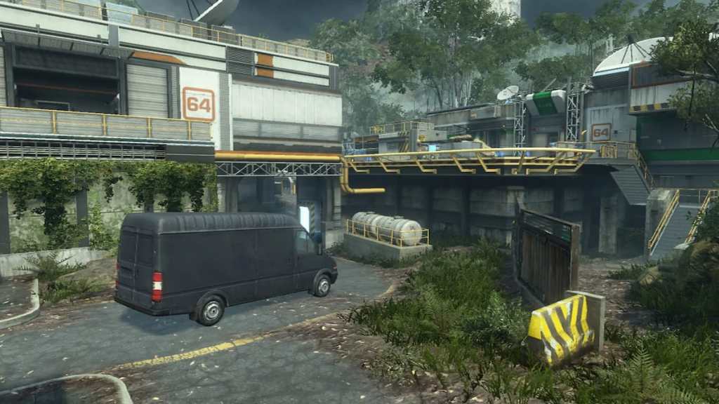
9. Exodus – Black Ops 3
Exodus was a signal of Call of Duty map design to come, with few alternate routes from section to section, poor sightlines, and being generally dull to play. It’s also visually noisy, aesthetically generic, and reduces Black Ops 3’s advanced movement system to more of a hindrance than a help.
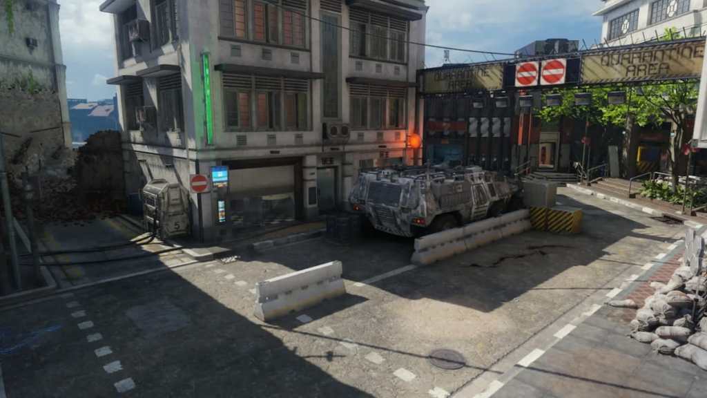
8. Derail – Modern Warfare 2
The Call of Duty series truly became a powerhouse with the release of Modern Warfare 2 in 2009. Scored by Hans Zimmer and featuring some of the best maps in the series, it also had Derail. This map was too big, too aesthetically one-dimensional, and catered to the worst habits of the community at the time. Most of its sightlines went unused, with almost all focus on controlling the central building, relegating the rest of the map to the dustbin.
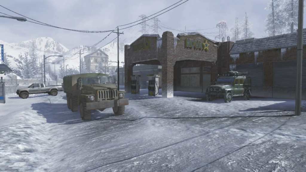
7. Wet Work – Call of Duty 4
Like Derail after it, Wet Work was another almost monochrome map with low visibility, an uninteresting and sometimes frustrating layout, and it was the ultimate spawn-killing fest. The map was hardly loaded before an endless number of CoD4’s busted frag grenades rained from the sky. Wet Work seemed custom-built for frag spam, and sniper lanes at either end of the map, plus the game’s hard-to-break spawns, made for an overall horrid time.
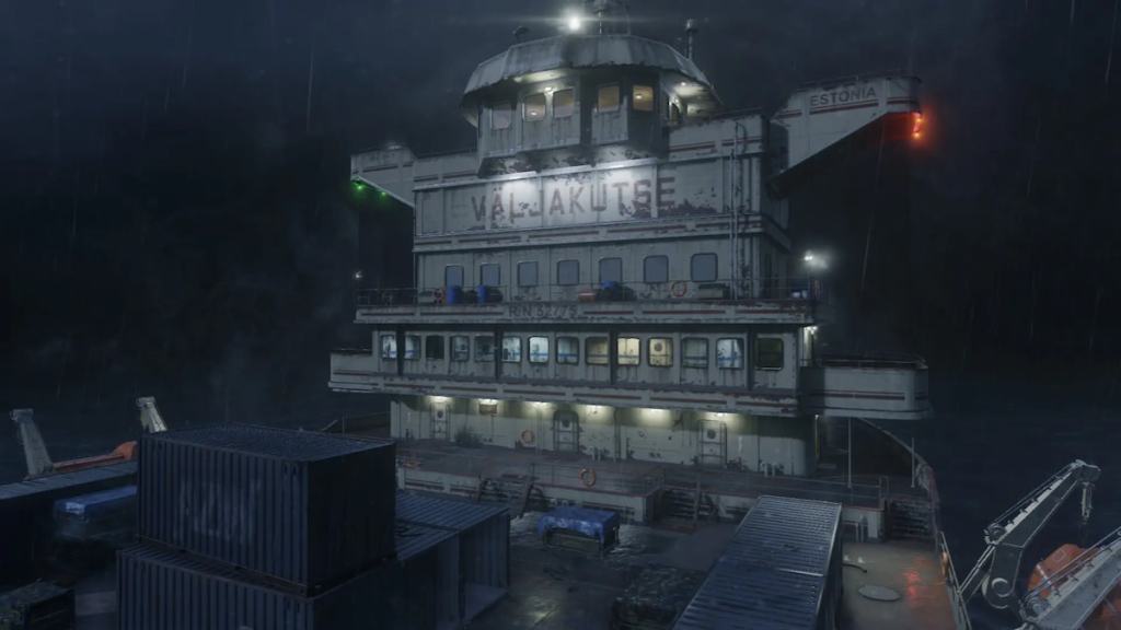
6. Downturn – Modern Warfare 3
None of Modern Warfare 3’s maps were particularly good, but Downturn somehow made all the others look it. In a sea of bland-looking, awkward-to-play experiences, this map was a mass of grey that played slower than even its large size should allow. It also neutered the game’s already limp killstreaks, and, thanks to its janky layout, made moment-to-moment gameplay both a guessing game and frustration.

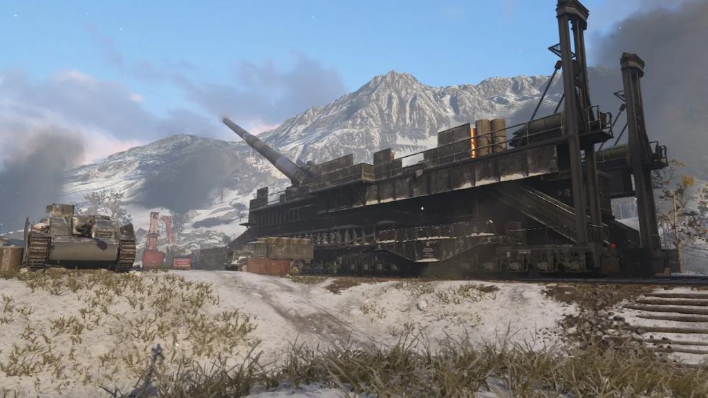
5. Gustav Cannon – World War II
Call of Duty: World War II is the definition of “it’s fine.” A vast sea of mediocrity of which Gustav Cannon was the main pockmark. Like Derail, the titular cannon was the focal point of the map, but because it was surrounded by an almost empty play area, he who controlled the cannon controlled the game. Few of the game’s weapons were suited for the map’s size, and if you stuck to the outskirts, you almost always accomplished nothing.
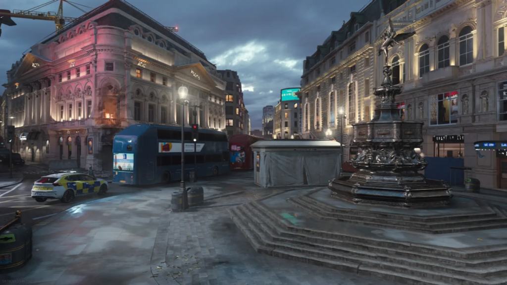
4. Piccadilly – Modern Warfare (2019)
The 2019 Modern Warfare reboot made the bold decision to do away with the three-lane map design template that had helped carry the series for decades. The result was some of the worst choices in the franchise, of which Picadilly was the most flawed. More circular than laned, the map was confusing to navigate at the best of times, and the plentiful hideyholes coupled with few quality flanking routes made for a slog of a play experience.
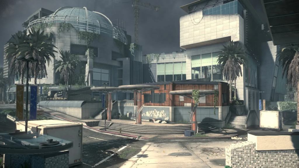
3. Stormfront from Ghosts
Ghosts is perhaps the worst game to come out of the Call of Duty series, discounting Call of Duty 3. It’s also the only game with two maps on this list. Stormfront is the least offensive of the pair, but it is still absolute trash. The map is too large, its focal points too spread out, and lacked any sense of flow. Moving from place to place was also unfun, as the series had yet to embrace infinite sprint, so odds are you would be stuck in the middle of nowhere for almost a minute before you reached anywhere resembling effective engagement distances.
2. Stonehaven – Ghosts
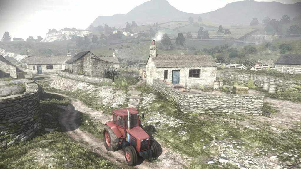
Stonehaven from Ghosts makes Stormfront look small and well-designed by comparison. This map is bigger, clunkier, and even less interesting to play, thanks to it being essentially a large flat plain with a castle at one end. Its size meant you might spend a minute or more just looking for someone to shoot, and if you died, you were likely to end up at one of its edges again, forcing another cross-country trek for another fight. Not even the castle section was well done, as it was somehow too big and was a single courtyard with a few upper levels and closable gates, trapping aggressors and defenders alike.
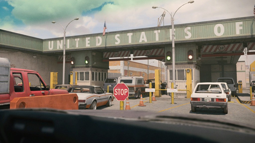
1. Santa Seña Border Crossing – Modern Warfare II
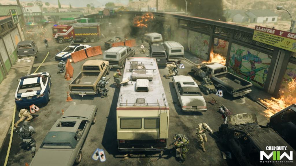
Choosing Santa Seña Border Crossing as the worst map in Call of Duty history is tough, as Stonehaven should wear that ignoble crown. However, Modern Warfare II’s worst map is filled with dozens and dozens of exploding cars, filling what amounts to a single-lane map with two underused side routes. Stonehaven is bad because it’s boring — Santa Seña is terrible because it’s tedious and infuriating. There’s almost no way to regain an upper hand here, and like Wet Work, every second you spend on the map is another where you might be blown up at random and from an angle you’d never expect. That the map is also pulled from a larger, and not higher-quality, Ground War one only makes playing it worse.

Published: Apr 2, 2023 09:35 pm