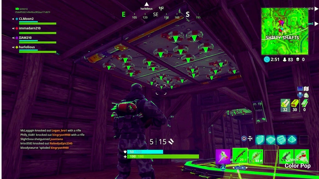
We’ve all been there in Fortnite: Battle Royale when you enter a room to see a trap on a wall and have a miniature heart attack—only to realize your teammate placed it.
We’ve all been there in Fortnite: Battle Royale when you enter a room to see a trap on a wall and have a miniature heart attack—only to realize your teammate placed it.
This concept image posted by Colton210 on Reddit is a great idea to differentiate between friendly and enemy traps, and would make a really nice addition to the game.

It’s obviously a quick edit, but it gives a good idea of how easy of a change it could be. It’s a small change, too, but one that has “quality of life” written all over it. Right now, there’s no visual difference between a friendly trap and an enemy trap.
Simply making the spikes inside the trap green would be a simple solution to this small conundrum—and it seems like it wouldn’t be difficult to implement, either.
Even if a color change to the trap itself isn’t the solution, some kind of visual indicator of trap ownership would be a really nice change to improve the player experience in the game.
Thankfully, Epic Games has been very responsive to the community’s suggestions and concerns, so more visibility of this proposal by Colton210 could end up changing the game for players everywhere.


Published: Mar 6, 2018 05:06 pm